Restaurant Menu Design
Updated November 9, 2026
Good restaurant menu design means a guest can read your menu at a glance, on a small screen, in a dim room. This guide covers colors, fonts, backgrounds and layout for a QR code menu, and how to check the result before guests see it.
Start with readability
- Contrast first. Dark text on a light background, or the reverse, without a busy picture in between.
- Text a phone can read. Descriptions that fit one or two lines, in a size you can read at arm's length.
- One look for the whole menu. The same colors and fonts on every category.
- Test on a phone, not only on a computer screen. Most guests read your menu on a phone.
Colors
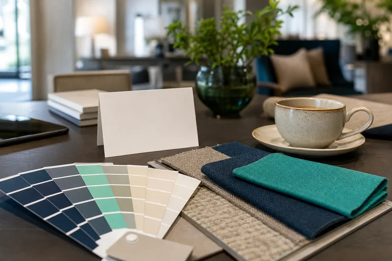
Pick two or three colors from your logo or your room: a dark one for text, a light one for the background, and one accent for category bars and buttons. Then check contrast. If you put an image behind the text, dim it. In the MenuHatch style editor the color picker supports transparency, so a semi-transparent color layer over a photo keeps the text readable. Dish cards and category bars can have their own colors and corner rounding.
Fonts
The font list is grouped: system default, elegant serif, display, handwriting and modern sans. A few rules help:
- One font for body text. A serif or a clean sans-serif reads best.
- A second font for titles, if you like. The "different font per text" switch lets each text type have its own font.
- Keep handwriting fonts for short titles. They are hard to read in a long description.
- Bold is not available for every font. The editor disables the bold switch for fonts without a bold weight.
Each text type has its own size, from small to large: menu title, menu description, main category, subcategory, dish title, dish description, price, labels and footer.
Backgrounds
The style editor lets you set the page background and the menu background separately. The types are solid color, gradient, mesh, pattern, animated and image. A calm background keeps attention on the dishes: a solid color or a soft gradient works for most places. Use patterns and animated backgrounds sparingly, and never behind long text.
Header and logo
The header can have a color or an image, a height you choose, and your logo in a size and position you set. You can also show the menu title and description inside the header. Keep the logo clear of the title, and test the header at phone width with the mobile view switch.
Layout details
- Spacing between the header, the categories and the dishes.
- Corners. Rounded or square categories, dish cards and buttons.
- The dish popup. Its background, text colors and border can be set separately.
- A menu border. A frame with a gap, width, color, corner radius and shadow around the menu.
Save, preview, publish
Save stores your changes as a draft. Preview shows the draft in a new tab, and only you can see it. Publish makes the draft the public menu. Check the draft on your phone before you publish. Which style options you can use depends on your plan.
Where to go next
Design is one part of a menu that works. See the best practices, the steps in how to create a QR code menu and the overview QR code menu for restaurants.
Common questions
Do I need a designer?
No. You choose colors, fonts and a background in the style editor and see the result at once.
Can I check the design before guests see it?
Yes. Save the draft and use Preview. Guests see the change only after you publish.
Does the design work on a phone?
The menu is built for the phone screen, and the editor has a mobile view switch to check the narrow layout.
How many fonts should I use?
One for the text and, if you like, a second for titles.
Style your menu with MenuHatch
Build your menu, choose your colors and fonts and preview it before you publish. Start with a free trial, no commitment.
Start free trial See pricing